Replatforming HealingWell
Transforming a legacy chronic illness platform into a calming, ad-streamlined, mobile-responsive community ecosystem.
The Challenge
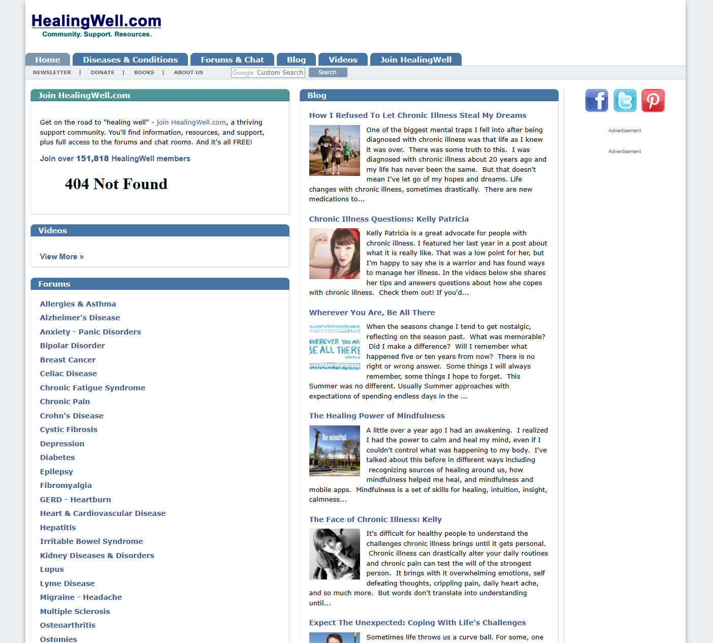
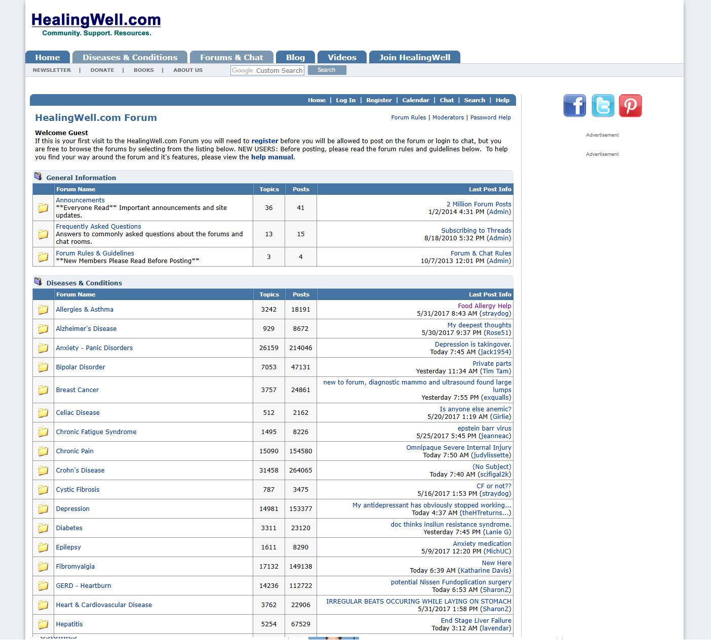
HealingWell is a long-standing, vital support lifeline hosting hundreds of thousands of members navigating chronic health conditions. However, the legacy web infrastructure suffered from severe UX erosion: the platform lacked any cohesive logo system, dense forum threads were unreadable on mobile screens, navigation layers were deeply fragmented, and ad placements directly cluttered core reading content flows.
The Objective: Execute a comprehensive, solo design transformation across 3 months. This required establishing a peaceful, trust-driven brand identity from scratch, modernizing the vBulletin forum interface for mobile devices, optimizing data discovery layers, and creating defensible, balanced ad blocks that protect vulnerable user groups from visual fatigue.
Phase 1: Identity Archetype & Calm Design Strategy
Because users arrive at HealingWell during moments of high personal vulnerability, anxiety, or pain, the visual system could not afford aggressive tech-centric styling. The strategy shifted toward a Calm Design philosophy, treating brand aesthetics as an active supportive intervention.
The Logo Mutation
The legacy website relied on un-styled web-browser lettering that lacked authority or emotional safety. My goal was to craft a dedicated symbol expressing peace, relaxation, and steady structural healing.
The Vector Topology: Engineering the SVG Brand Symbol
Using Adobe Creative Suite, I handcrafted the new visual identity layers from scratch—drawing organic, balanced geometry curves tailored specifically to project safety and emotional calm. Once the vector paths and custom therapeutic color gradients were locked within the design canvas, I systematically audited and optimized the raw vector node output. This combined precise creative vector craftsmanship with a clean, low-latency asset structure built directly for responsive digital viewports.

• Hand-drawn continuous cubic Bezier curves constructed using precision anchor vectors to achieve fluid, calming curvatures.
• Cleaned up messy sub-pixel anchor drift within the vector workspace layout to ensure crisp, razor-sharp rendering on high-density Retina and OLED displays.
• Embedded optimized letterform spacing metrics directly inside the native markup layers to preserve layout harmony across mobile device layouts.
• Programmatically removed the outdated legacy ".com" suffix string to shift focus completely toward a modern, premium brand look.
Peaceful Geometry
"Visual shapes should project immediate stability and breathing room."
Therapeutic Palettes
"Dampening nervous system spikes through balanced light waves."
De-Escalating Readability
"Users under cognitive load require massive macro-spacing and clean line heights."
Phase 2: Platform Architecture & Component Engineering
To transition HealingWell from a cluttered directory into a responsive community space, I restructured the informational framework into intuitive, mobile-first layouts while isolating conversational threads from noisy commercial blocks.
The Tri-Discovery Information Layout
I dismantled the multi-column legacy landing tables and engineered a clear, vertical content flow built around modern user mental models:
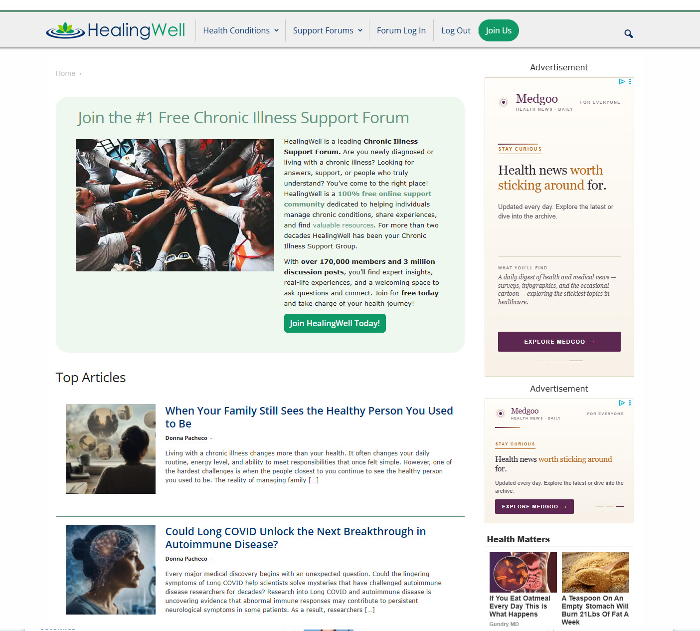
- Unified Identity Hub: Replaced the old text header with a calming, dedicated brand symbol, instantly signaling professional medical authority and emotional sanctuary upon page load.
- Streamlined Medical Condition Directories: Reorganized the dense list of diseases into high-contrast, thumb-friendly navigation blocks optimized for easy scrolling on mobile devices.
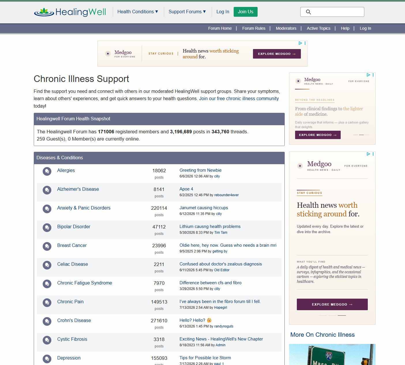
- Isolated Forum Dashboards: Grouped vBulletin community feeds, recent blog articles, and video resource archives into distinct semantic categories to prevent visual fatigue and cross-topic bleeding.
Visualizing Ecosystem Re-Platforming
The redesigned interfaces focus heavily on mobile-first reading grids, converting dense columns into clear, readable discussion timelines.
Phase 3: Balancing the Triad Constraints
Re-platforming a high-volume community site requires managing user empathy alongside business survival. I balanced these overlapping priorities by aligning usability improvements with commercial ad requirements and responsive framework realities.
De-escalating Cognitive Load
The legacy multi-column structure caused intense visual noise, making it incredibly difficult for users dealing with physical chronic symptoms to read long discussion threads.
- Collapsed the chaotic four-column grid into a clean, unified single-column viewport.
- Redesigned the crowded list of over 40 medical condition links into an accessible, categorizable index.
- Enlarged the interactive touch zones on forum text links to eliminate mis-clicks on mobile devices.
Designing for Physical Stress
Users navigating chronic illness communities frequently experience visual fatigue, motor control challenges, or cognitive stress during flares.
- Set font contrast ratios to strictly exceed WCAG 2.1 AA parameters across both light and dark backgrounds.
- Increased the global body font sizes and line spacing to protect readability for visually strained users.
- Simplified the multi-step user onboarding and registration forms into intuitive, step-by-step mobile views.
Streamlining Monetization Safely
As a free platform, HealingWell relies entirely on ad placements. The redesign needed to protect user focus without hurting the site's essential revenue streams.
- Moved intrusive ads out of content spaces and into dedicated, clear sidebar and footer slots.
- Fixed ad containers to specific aspect ratios to prevent jarring layout shifts when banners load.
- Established clean styling rules that prevent promotional blocks from mimicking actual community posts.
The Outcome & Impact
The updated HealingWell design successfully transformed a fragmented, legacy portal into a peaceful, welcoming support network. By prioritizing mobile responsiveness, establishing a calming identity, and separating content loops from promotional blocks, the platform secured its role as an accessible, modern refuge for patients worldwide.
Calm Brand Authority
The introduction of a peaceful logo and brand system instantly elevated user trust, replacing an outdated web directory look with a polished digital medical sanctuary.
Mobile Forum Growth
Updating the vBulletin message board layouts directly lowered reading barriers, enabling members to post, reply, and share tips comfortably from their smartphones.
Streamlined Ad Balance
Isolating ad banner regions proved that community monetization can live side-by-side with high readability standards, preserving business revenue while eliminating user frustration.