Higher Ed Program Selection Journey
Transforming a legacy paper workflow into a universally accessible, user-centered digital ecosystem.
The Challenge
Declaring or changing an academic major or minor is a pivotal milestone in a student’s university lifecycle. Historically, this process relied on a fragmented, manual, paper-based workflow that created significant administrative bottlenecks and left students feeling disconnected.
The Objective: Build a public-facing, user-centered digital application that allows prospective and current students to seamlessly filter academic programs and submit digital declarations, all while navigating a small team's technical constraints and strict accessibility requirements.
Phase 1: Discovery & Research
To understand the landscape and our users, the project kicked off with competitive benchmarking and qualitative user mapping.
Competitive Analysis
I audited the program-selection systems of peer higher education institutions. This analysis revealed a common pitfall: most universities treated program declaration as a rigid administrative form rather than a dynamic discovery tool.
User Persona Development
We needed to serve a highly diverse user base. I synthesized our user research into matrixed personas to capture unique workflows, tech-literacy levels, and pain points:
- The Prospective Student: Needs an intuitive, public-facing interface to explore options and understand program requirements before enrolling.
- The Current Student: Wants a frictionless, self-service utility to swiftly declare or modify their academic path.
- The Faculty Advisor & Administrative Staff: Requires a robust, clear dashboard view to review, process, and track student applications without manual entry.
The Current Student
"I just want to change my minor without tracking down physical signatures across campus."
The Prospective Student
"I'm comparing three universities. I need to know exactly what classes a major requires."
The Faculty Advisor
"Manually typing student data from paper slips eats up hours I should be spending on active coaching."
Phase 2: Information Architecture & Component Engineering
To condense hundreds of diverse academic paths into a seamless browsing utility, I engineered a multi-tiered information architecture that supports three distinct discovery workflows: guided exploration, structural drilling, and direct lookup.
The Tri-Discovery Filtering Framework
I translated complex university catalog data into an intuitive control schema composed of three co-dependent filter layers:
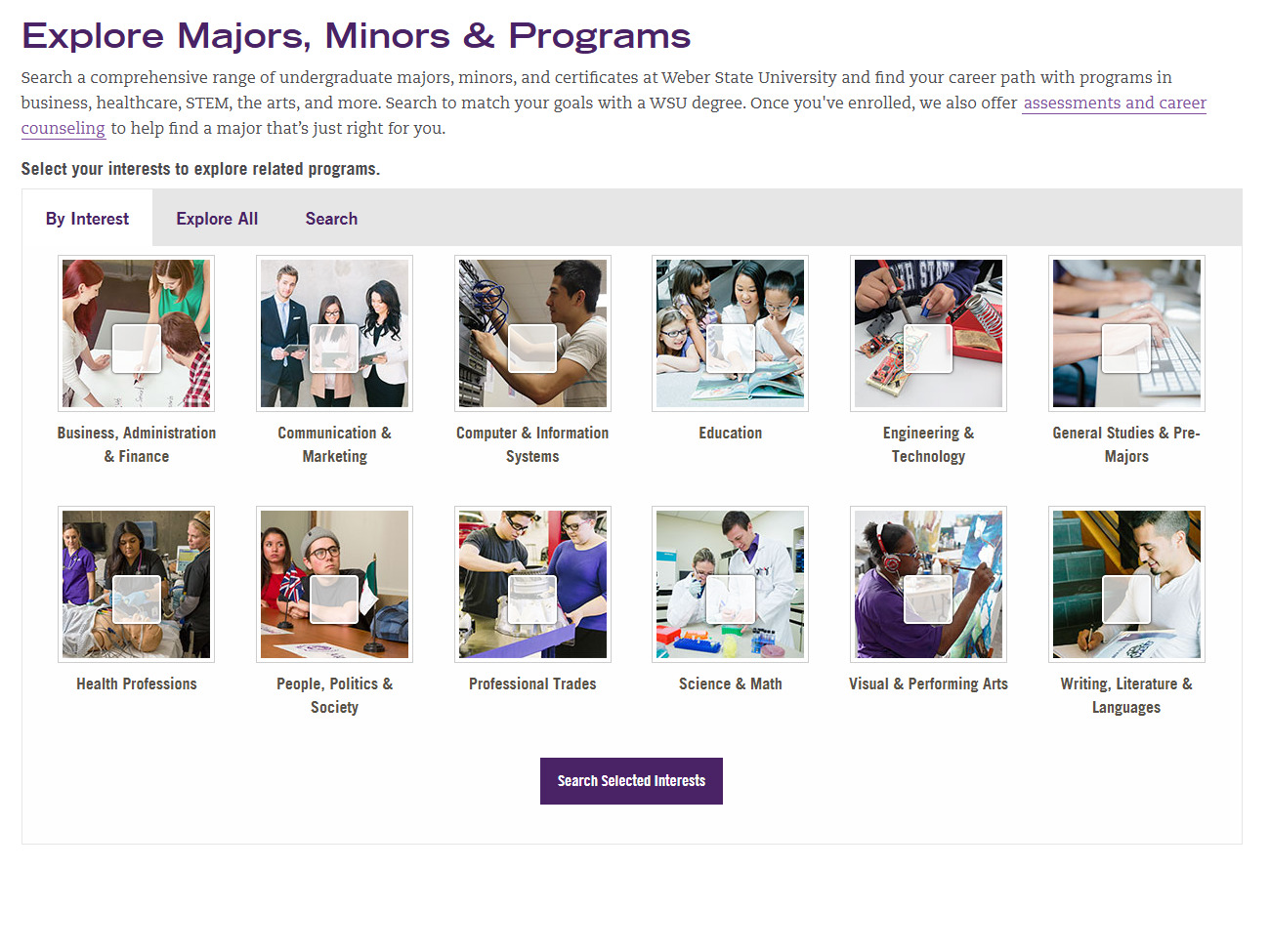
- Categorization by Interest: Grouped disparate programs into universal semantic categories (e.g., *Computer & Information Systems*, *Health Professions*, *Visual & Performing Arts*) allowing exploratory users to discover relevant paths based on natural inclinations.
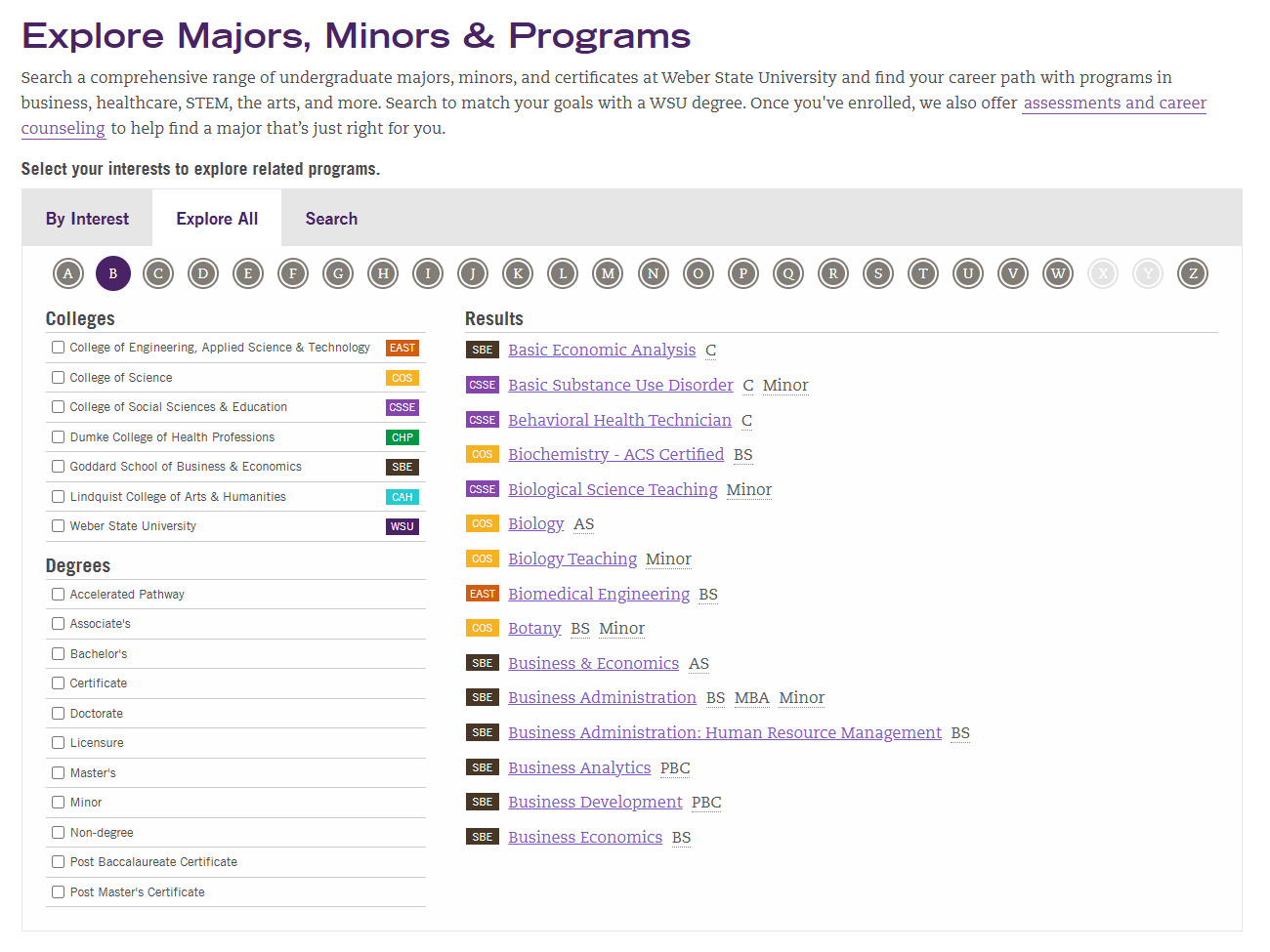
- Structural Drilling by College: Provided advanced controls to filter listings by academic divisions, mapping directly to colleges like EAST (Engineering, Applied Science & Technology), Goddard School of Business, and Dumke College of Health Professions.
- Granular Degree Classification: Enabled precise filtering by credential type, ranging from full Bachelor's and Master's degrees to Minors, Certificates, and Licensures.
Navigational Mechanics & Direct Lookup
Recognizing that user groups approach program selection with varying levels of intent, I incorporated two alternative fast-path navigation layers:
- The A-Z Alphabetical Index: A continuous layout grid of letter anchors allowing current students who already know their target program to instantly jump directly to specific listings with a single click.
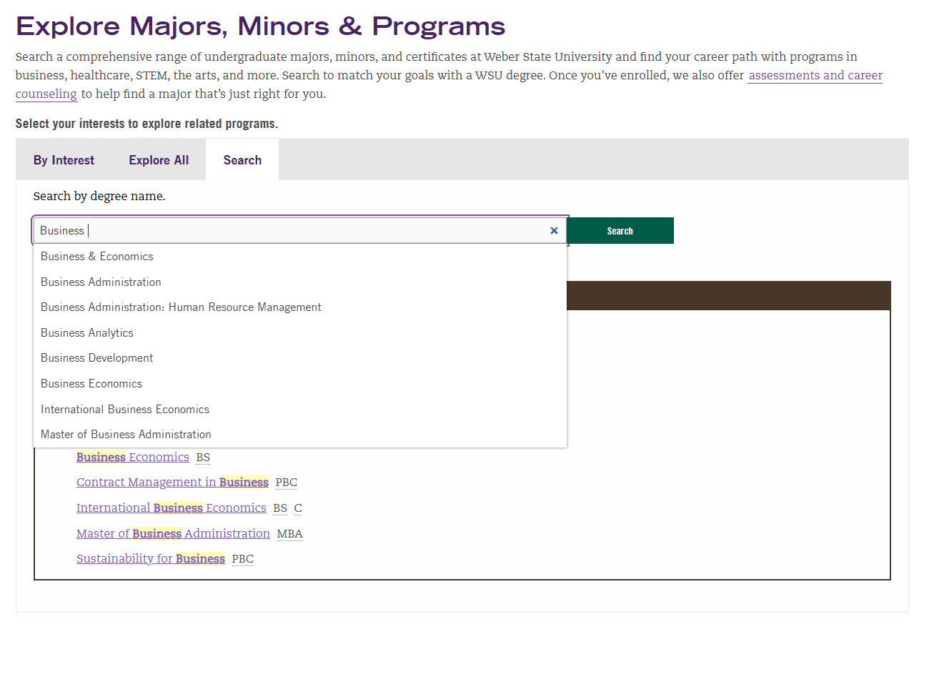
- Direct Predictive Search: A streamlined alphanumeric input utility ("Search by degree name") that provides instantaneous, direct filtering for highly targeted query matching.
Engineering the Multi-Modal Filter Ecosystem
The deployed portal layout uses a three-tab toggle system to support distinct search mentalities: visual discovery, structured auditing, and direct keyword mapping.
Phase 3: Balancing the Triad Constraints
A beautiful interface is meaningless if it isn't usable, universally accessible, or technically feasible. I managed these overlapping priorities by engineering an interactive system that balanced user satisfaction against strict university compliance rules and engineering resource limitations.
Simplifying Complex Catalog Architecture
Initial testing cohorts revealed that students struggled to parse dense, academic terminology when looking for basic degree variations.
- Streamlined administrative vocabulary into intuitive, user-facing discovery microcopy.
- Engineered a clear visual component hierarchy that separates multi-select checkboxes from direct term lookups.
- Created contextual layout spacing to distinguish major programs from quick certificate paths.
Designing for Universal Inclusivity
For a public institution, digital equity is non-negotiable. The application required deep WCAG alignment to serve all abilities and reduce legal friction.
- Audited color tokens directly against WCAG 2.1 AA specifications to secure high contrast ratios.
- Enforced semantic keyboard-only focal targets so motor-impaired users can navigate every accordion and filter layer.
- Optimized DOM structures and label text properties to support seamless rendering on active screen readers.
Engineering Within Lean Parameters
Operating with a small engineering team and limited internal bandwidth required smart architectural scoping to avoid project bloat.
- Mapped out all design variants on an Impact-versus-Effort Matrix to deliver a highly functional MVP.
- Utilized standard web native component behaviors to prevent hours of unnecessary custom development.
- Maintained continuous collaboration loops with engineering to rapidly pivot designs when backend constraints appeared.
The Outcome & Impact
By moving the major and minor declaration process into a functional, public-facing digital environment, we successfully mitigated the operational bottlenecks of the legacy paper pipeline. The product successfully transitioned from the development environment to full university production, resulting in a streamlined lifecycle for both students and administration.
Frictionless Program Discovery
Empowered current and prospective students to independently self-source academic choices through the Tri-Discovery framework. This successfully eliminated the drop-off friction commonly associated with opaque administrative procedures.
Elimination of Processing Overhead
Drastically lowered the manual administrative burden on faculty advisors and registrars. Shifting declarations to a structured digital input pattern completely removed legacy manual data-entry errors and signature-routing delays.
System-Wide Satisfaction Lift
Post-deployment qualitative feedback indicated an immediate upgrade in user trust and task-success rates. The system proved that accessible, WCAG-compliant design patterns directly scale user onboarding across highly diverse student cohorts.