Institutional Brand Governance
Architecting a centralized UI Style Guide framework to protect brand fidelity and enforce WCAG compliance within legacy system constraints.
The Challenge
Managing an institutional web footprint across hundreds of academic departments requires strict operational control. At Weber State University, our digital ecosystem faced extreme visual fragmentation due to localized styling alongside severe technical limits embedded in our legacy CMS, Site Manager.
The Objective: Build a living, framework-driven UI Style Guide to serve as an enterprise source of truth, helping university creators seamlessly apply consistent, accessible interface elements without breaking core brand standards or system parameters.
Phase 1: Discovery & Research
To understand the landscape and our users, the project kicked off with competitive benchmarking and qualitative user mapping across our matrixed personas.
User Persona Development
We needed to serve a highly diverse user base. I synthesized our user research into matrixed personas to capture unique workflows, tech-literacy levels, and pain points:
- The Content Editor: Needs an intuitive, snippet-based component library to publish department news cleanly without breaking layouts or formatting rules.
- The Campus Web Developer: Wants a robust, production-ready framework utility built on clean SASS/CSS classes to speed up active sprint deployments.
- The Brand Manager: Requires centralized, immutable system styles to lock in brand standards globally and eliminate manual design compliance reviews.
The Content Editor
"I just need to publish department news without formatting errors breaking our desktop layout."
The Campus Web Developer
"I want to build a custom application for student affairs that looks and feels exactly like the main university brand."
The Brand Manager
"Decentralized departments keep modifying our official colors and typography, diluting our visual identity."
Phase 2: Information Architecture & Component Engineering
To manage hundreds of diverse layout variants across web domains, I engineered a modular asset ecosystem that abstracts framework configurations into plug-and-play code snippets.
The Tri-Token Tokenization Framework
I compressed our complex brand guide standards into three co-dependent utility layers to keep platform governance absolute:
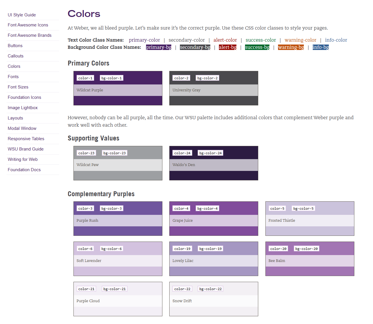
- Color Mapping & Brand Values: Locked in immutable variables for Wildcat Purple, University Gray, and essential supporting accents.
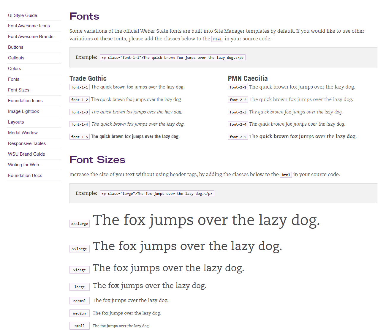
- Structural Typography Hierarchies: Codified global font weights, line heights, and layout scales across all browser resolutions.
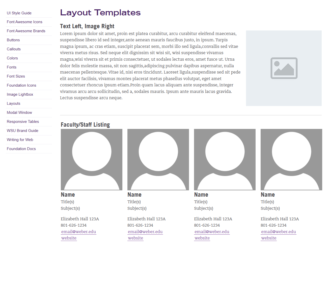
- Utility-Driven Layout Modules: Engineered robust helper patterns for repeating elements like responsive data grids and alerts.
Engineering the Living Component Directory
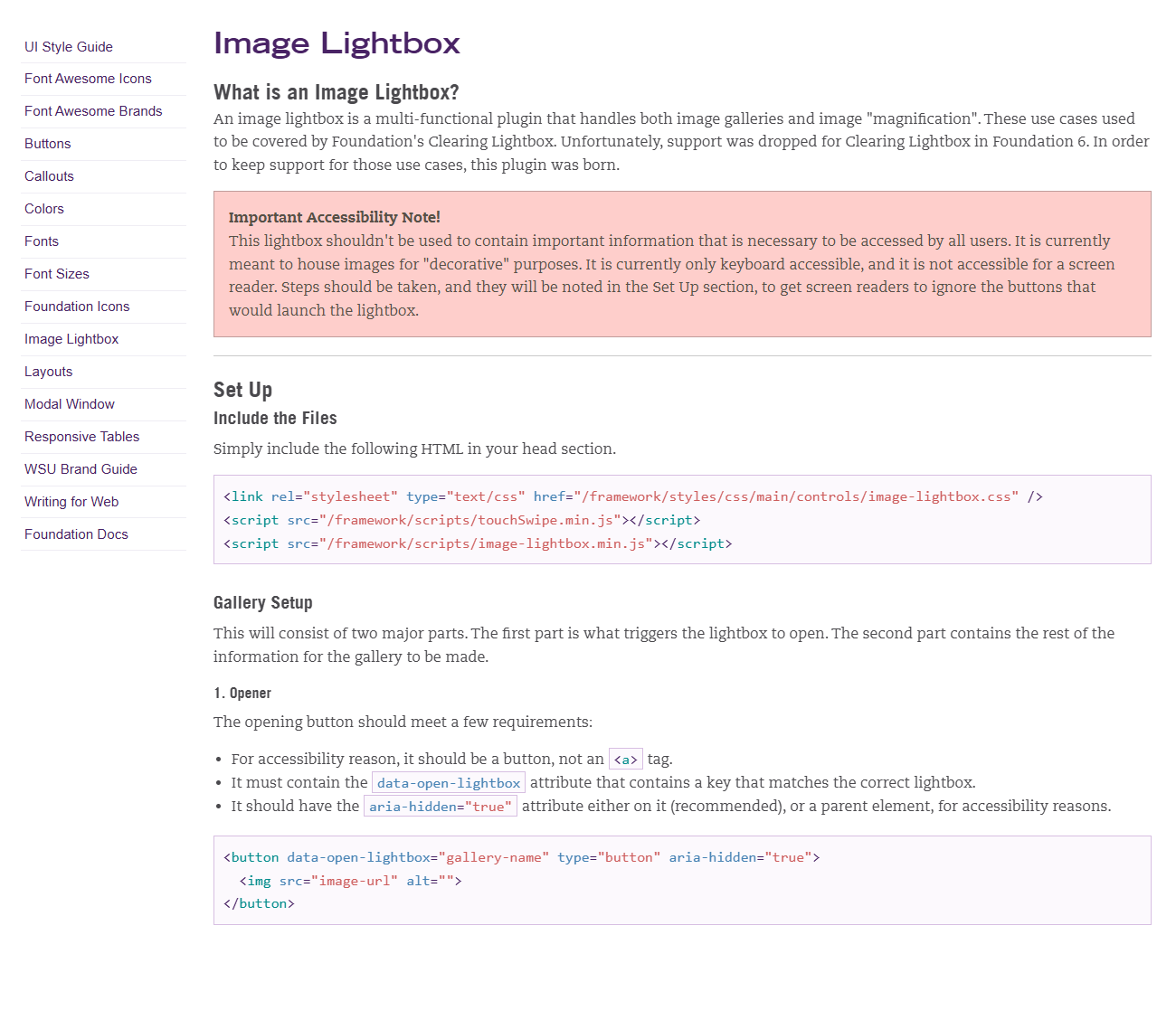
The deployed UI Style Guide portal enables developers and non-technical managers to reference style rules and extract raw layout modules instantly.
Phase 3: Balancing the Triad Constraints
Enforcing design guidelines meant engineering an interface strategy that balanced user needs against institutional accessibility laws and platform constraints.
Simplifying Sprawling Documentation
Initial technical audits revealed that campus authors couldn't navigate old, scattered style sheets when deploying basic pages.
- Streamlined documentation into a single, clean, searchable living system index.
- Separated abstract visual variables from executable frontend utility markups.
- Built highly visible, accessible copy-to-clipboard blocks for effortless layout reproduction.
Designing for Universal Inclusivity
As a public university, compliance is non-negotiable. The platform required deep alignment with universal web standards to support all users.
- Audited and locked all background color variables against WCAG 2.1 AA contrast thresholds.
- Embedded semantic keyboard focus patterns and native skip links into layout modules out of the box.
- Standardized core icon structures (Font Awesome & Foundation base) with clean ARIA attributes.
Defensive Programming in a Stubborn CMS
Site Manager imposes strict formatting blocks that heavily alter or drop standard container layouts, risking design breakages.
- Applied defensive CSS methodology selectors to shield components from inherited layout container breaks.
- Split components into standalone code snippets to ensure layout integrity inside primitive layout cells.
- Configured asset builds to overwrite legacy inline code defaults without destabilizing global sub-brand systems.
The Outcome & Impact
Deploying the live style guide successfully established system alignment across all web properties without straining our engineering velocity. The guide transformed manual design reviews into a self-service code layer.
Autonomous Asset Deployment
Gave decentralized content creators the freedom to quickly self-source layouts while safely staying inside brand guidelines by default.
Elimination of Engineering Overhead
Drastically dropped duplicate front-end work across development cohorts by providing pre-tested component models for fast configuration.
System-Wide Compliance Safeguard
Protected the university from critical legal issues by making sure all new platform expansions are structurally accessible from day one.